
WORDMARK - ADVERTISEMENT - SIGNAGE & WAYFINDING
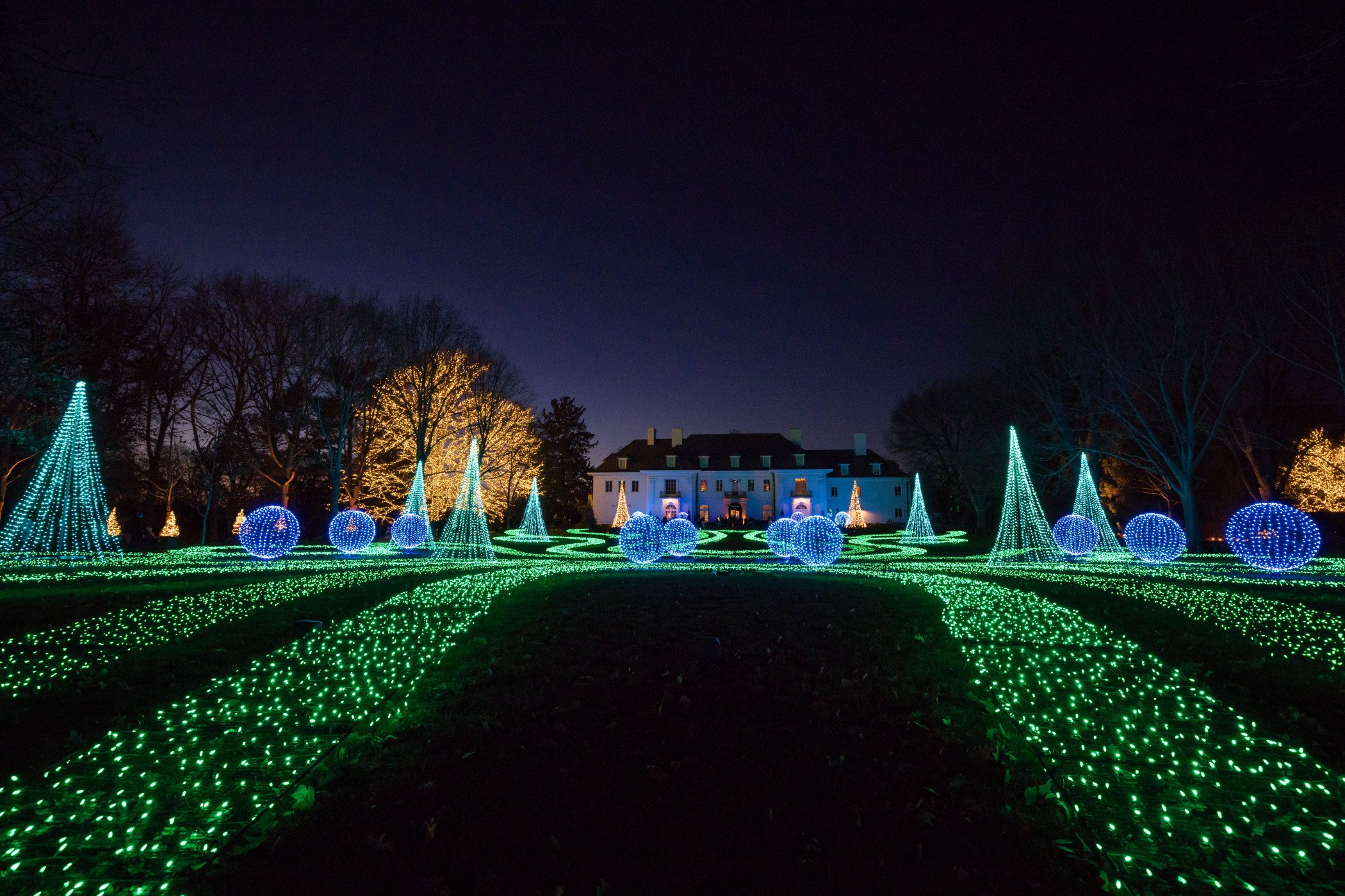
Since its start, Winterlights has been synonymous with magic, wonder, and holiday joy here in Indianapolis. Now, building upon this cherished legacy, a fresh chapter unfolds as the festival introduces a stunning evolution of the beloved Winterlights wordmark.
WORDMARK
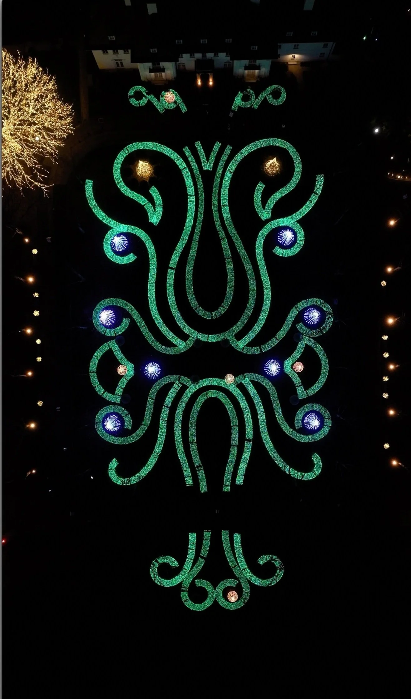
Inspired by the intricate swirl accents found in the festival's original architectural designs, the new design integrates these elements into the familiar Newfields brand font.

MARKETING
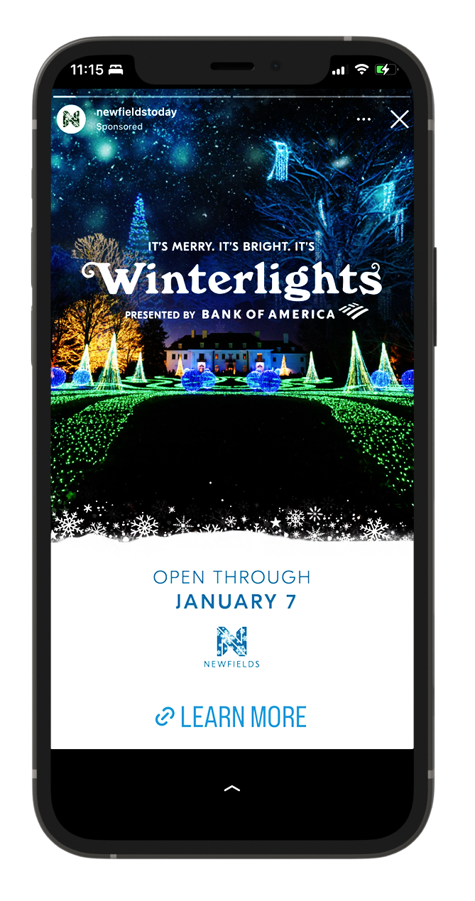
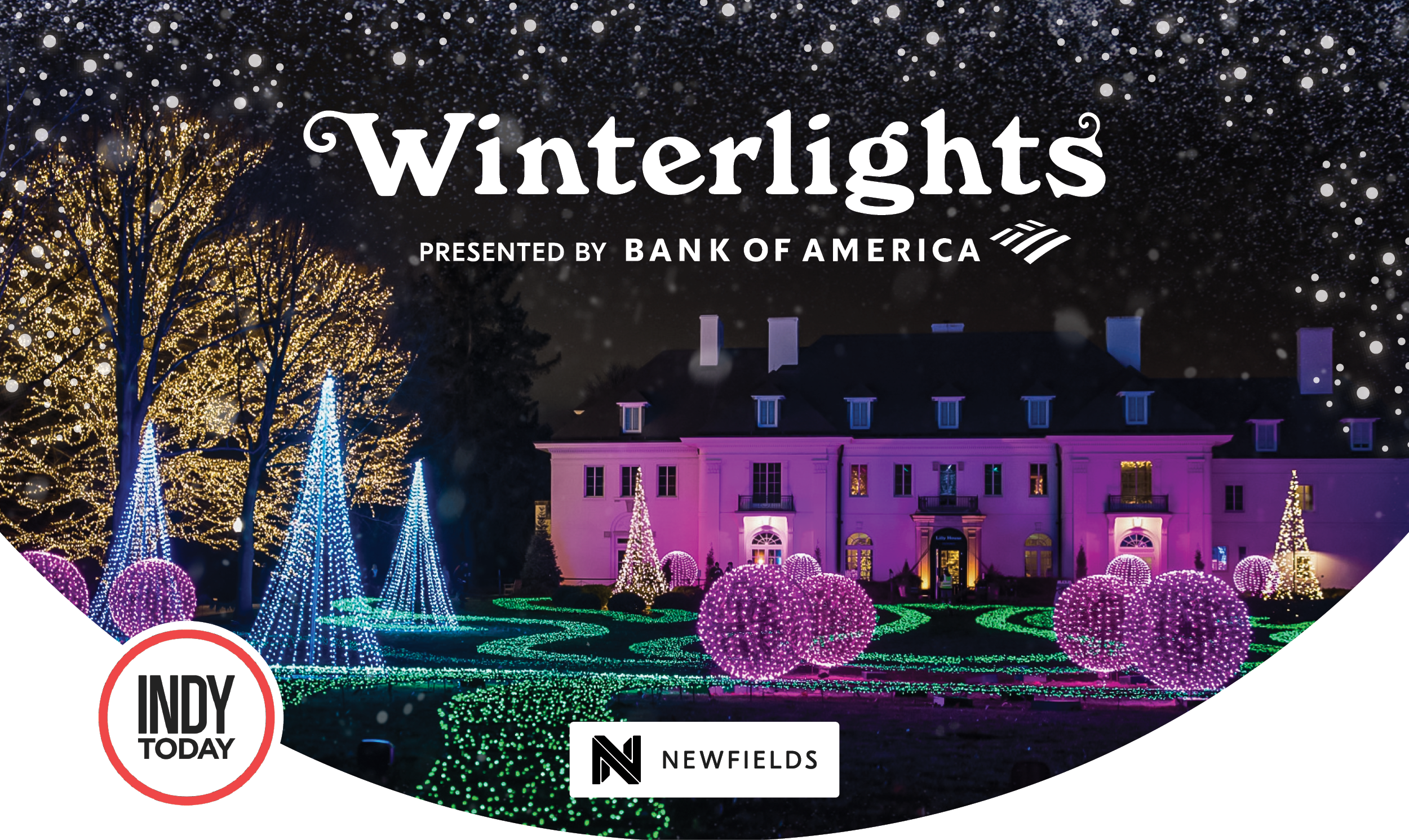
Drawing inspiration from the enchanting atmosphere of the event, I designed visuals that captured the essence of Winterlights – a symphony of lights, wonder, and joy. By integrating compelling imagery with visual effects, these ads invite viewers to immerse themselves in the magic of Winterlights.
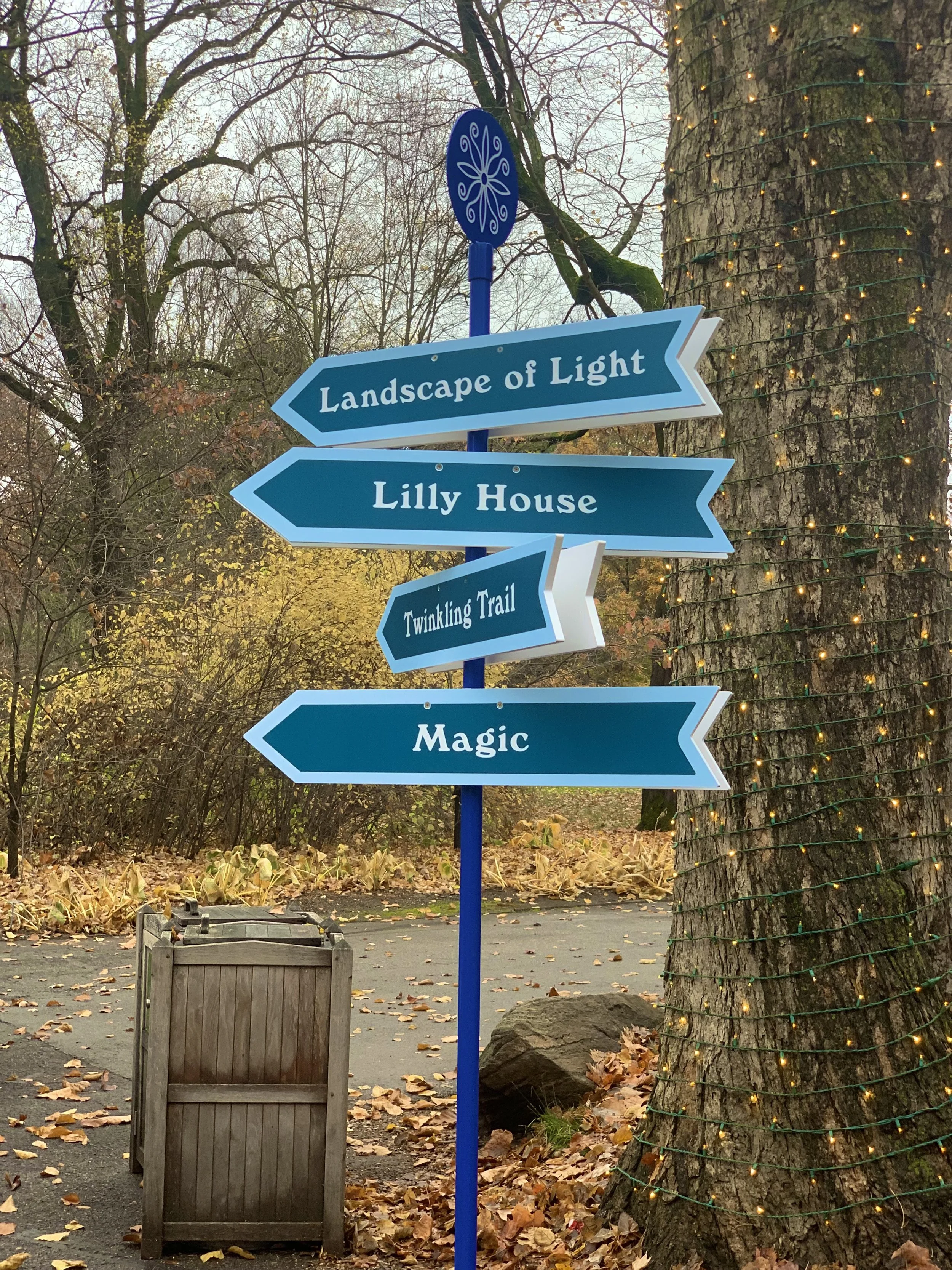
With sustainability and improved guest experience at the forefront, I devised a creative solution to enhance wayfinding at the festival by introducing an eco-friendly wayfinding pole adorned with directional arrows. Observing that traditional plastic A-Frame signs often failed to engage visitors and detracted from the immersive experience, I aimed to integrate navigational aids seamlessly into the festival environment. This initiative underscores my dedication to creative problem-solving that prioritizes functionality and sustainability.
SIGNAGE + WAYFINDING
VIDEO (2024)
Role: Creative direction, gathering images, story boards, typography
